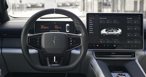
News - PolestarPolestar details hi-tech HMI for 3 and 4 SUVsInfotainment, instruments, interaction a lesson in using every last pixel: Polestar21 May 2024 By MATT BROGAN in SPAIN POLESTAR is already well known for the attention to detail of its design, the Sino-Swedish brand employing typical Scandinavian minimalism in every element of its vehicles’ exterior and interior to create a fuss-free yet desirable composition.
The car-maker also aims to carry over a combination of beauty and simplicity its vehicles’ human-machine interfaces (or HMI), where the ethos of Scandinavian minimalism is applied not only to the systems’ appearance (or User Interface), but also its interaction (or User Experience).
It is an intentional approach with the goal of delivering a continuity of design that flows into the relationship an owner has with their vehicle, while also ensuring a distraction-free environment in which the vehicle’s many complex systems are easily and safely accessed.
“It is important these values align with those of the car. We put all our efforts into making it easy to use and to make it simple to avoid driver distraction and provide the right information at the right moment – content on demand,” explained Polestar senior UX researcher Antonio Cobaleda.
“For the visual design part, we strongly believe in providing something that is beautiful. We have a great passion for precision, and to create something that is truly unique. No efforts have been spared in creating the best balance here (between UI and UX).”
Utilising Android Automotive technology, the Polestar array incorporates the Google ecosystem into a design by Mr Cobaleda and his team to create presentation of and interaction with the various systems that feels familiar and logical for customers.
The menu screens are designed to remain easy to navigate, irrespective of how far the user has ‘drilled down’ into the settings, the home screen providing three simple ‘bars’ in addition to the navigation map to offer easy access to apps (such as music or phone contacts), quick actions (shortcuts to favourited widgets which like other functions are set to the driver’s profile via the key), and system controls (including climate control, vehicle settings, and the home button).
“Our system is based on Android Automotive, meaning that we have brought the Google ecosystem to our cars,” said Mr Cobaleda
"We have designed the home screen with a split screen format that can be resized (and personalised) so that you can get more of the map, or more of the widgets.
“The important thing is that both the map and the app that you have open are fully functional, they are running in parallel. That also means that you have fewer interactions.”
As well as presenting the information logically, it is obvious that the Scandi design of the Polestar marque is present in every element – and in each interaction. A carefully selected colour palette is paired with just a single font to ensure uniformity across each menu page.
The infotainment system and instrument panel mimic each other carefully here to ensure that not a single element is out of place, the high resolution of each screen utilised to create accurate graphics within each “card”, with nary a pixel out of place.
“Even though the format of each screen is different, we follow the same principles. Every pixel has a home in the screen – every pixel is designed to fit in the screen as we intend – and there is a lot of intentionality in the design,” emphasised Mr Cobaleda.
“Everything is aligned. Everything is consistent … We put a lot of effort into delivering clear messages, avoiding over-design.
“In the detail page we include animations of how the functions of the car work. We focus on adding value and this is part of the visual identity of Polestar. Celebrating technology, but focusing on what adds value, what gives you the right message.”
That message is aided by a pared-back colour palette and concise lettering, making the various screens easy to read at a glance.
Polestar spent considerable time researching which combinations offer the highest level of clarity when viewed on the move, ensuring the driver’s eyes do not wander away from the road for any considerable time.
It is a small but important piece of the Polestar puzzle that contributes not only to the appearance and operation of the HMI, but also to the overall safety.
Hopefully, more OEMs become aware of as vehicles move into an era where everything is controlled by the screen.
Visit GoAuto again soon for our international launch review of the Polestar 3 and 4 range from Spain.  Read more4th of April 2024  Coupe-style Polestar 4 SUV here in AugustPolestar 4 to round-out 2024 launch activity for premium Sino-Swedish EV importer2nd of April 2024  2024 Polestar 2 Long Range AWD ReviewProspective Polestar buyer takes the keys to updated ‘2’, marking a move from turbo-petrol Audi26th of March 2024  Polestar 3 slashes emissions footprintCradle-to-gate carbon footprint of Polestar’s first SUV lower than smaller Polestar 2’s4th of March 2024  Plastic recycling claims discredited by CCI reportCCI report labelling plastic recycling ‘fraud’ puts eco-friendly car-maker claims in spotlight |
Click to sharePolestar articlesMotor industry news |


Facebook Twitter Instagram